Ice Queen
2018-Ongoing
Photo styling by Beverly James Neel
Contribution:
Creative Direction Brand Design
Deliverables:
Brand Guidelines Packaging Design
2018-Ongoing
Photo styling by Beverly James Neel
Contribution:
Creative Direction Brand Design
Deliverables:
Brand Guidelines Packaging Design
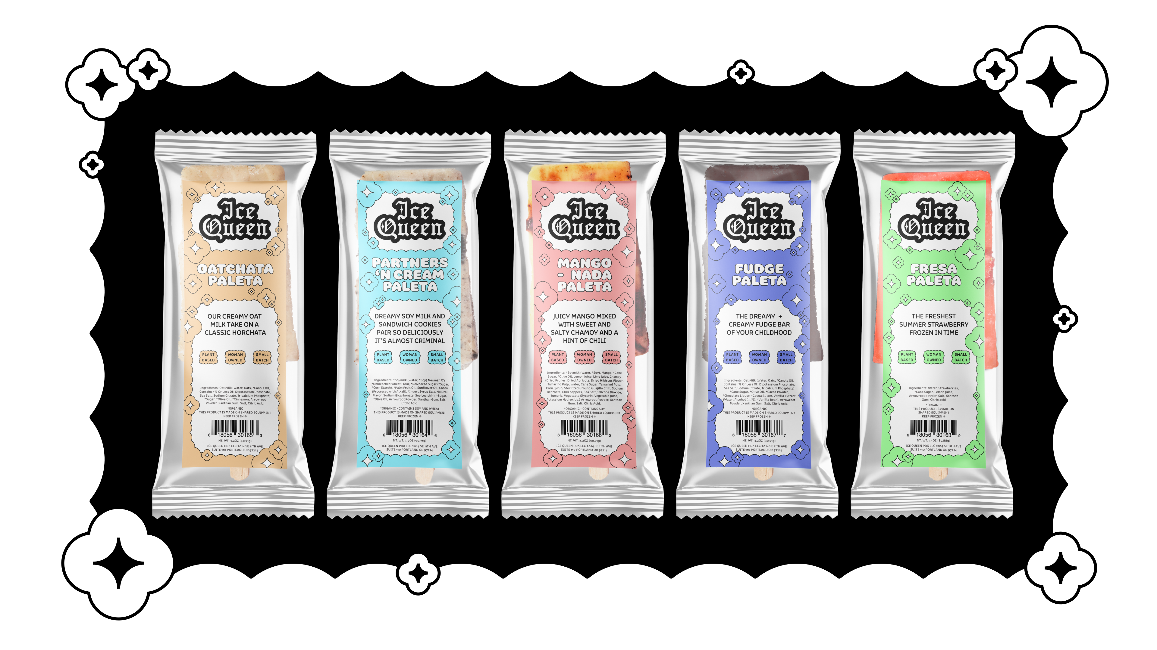
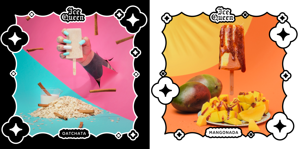
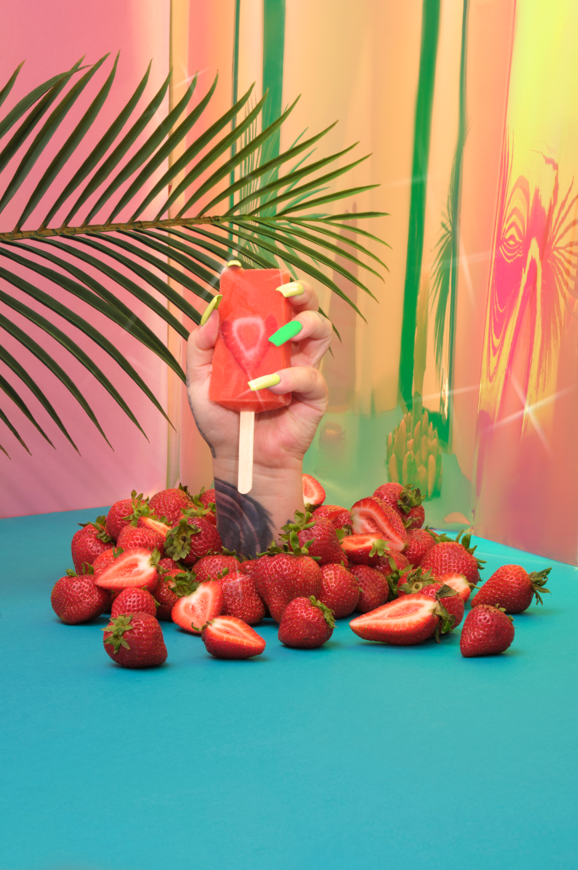
In the fiercely competitive frozen dessert market, the challenge was clear: create a brand that not only stands out but also captivates the hearts and palates of consumers. The opportunity arose with Ice Queen founder Rebecca Smith, whose rich heritage brings a piece of her Bay Area childhood right into Portland's heart with every frozen treat she makes.
The solution was Ice Queen's vibrant brand identity, characterized by an undulating cloud design system and a playful fusion of typography influenced by the Chicano art Rebecca grew up around. This visually striking identity not only grabs attention on store shelves but also beckons new customers daily, drawn in by Ice Queen's distinct perspective in the space.
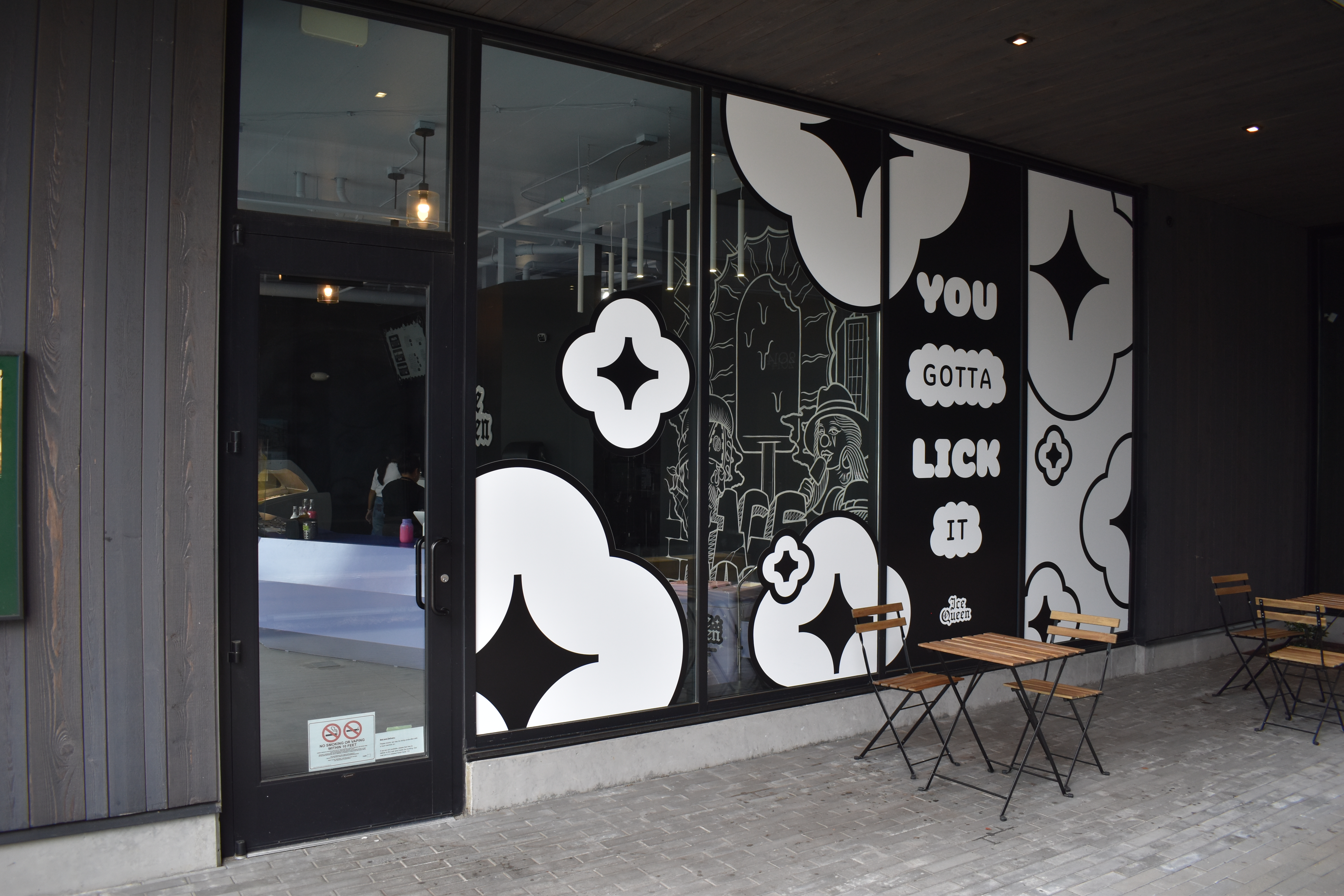
The success of Ice Queen's brand didn't stop there. It has since extended to a Portland, Oregon storefront, transformed into a whimsical, candy-painted ice cave. This immersive spatial design further elevated the brand's appeal, creating a sensory experience that resonated with customers.
Recognized for its innovation and creativity, Ice Queen was honored with the title of Best Vegan Ice Cream brand in America 2023 by VegNews—a testament to its growing influence and popularity.
The solution was Ice Queen's vibrant brand identity, characterized by an undulating cloud design system and a playful fusion of typography influenced by the Chicano art Rebecca grew up around. This visually striking identity not only grabs attention on store shelves but also beckons new customers daily, drawn in by Ice Queen's distinct perspective in the space.
The success of Ice Queen's brand didn't stop there. It has since extended to a Portland, Oregon storefront, transformed into a whimsical, candy-painted ice cave. This immersive spatial design further elevated the brand's appeal, creating a sensory experience that resonated with customers.
Recognized for its innovation and creativity, Ice Queen was honored with the title of Best Vegan Ice Cream brand in America 2023 by VegNews—a testament to its growing influence and popularity.


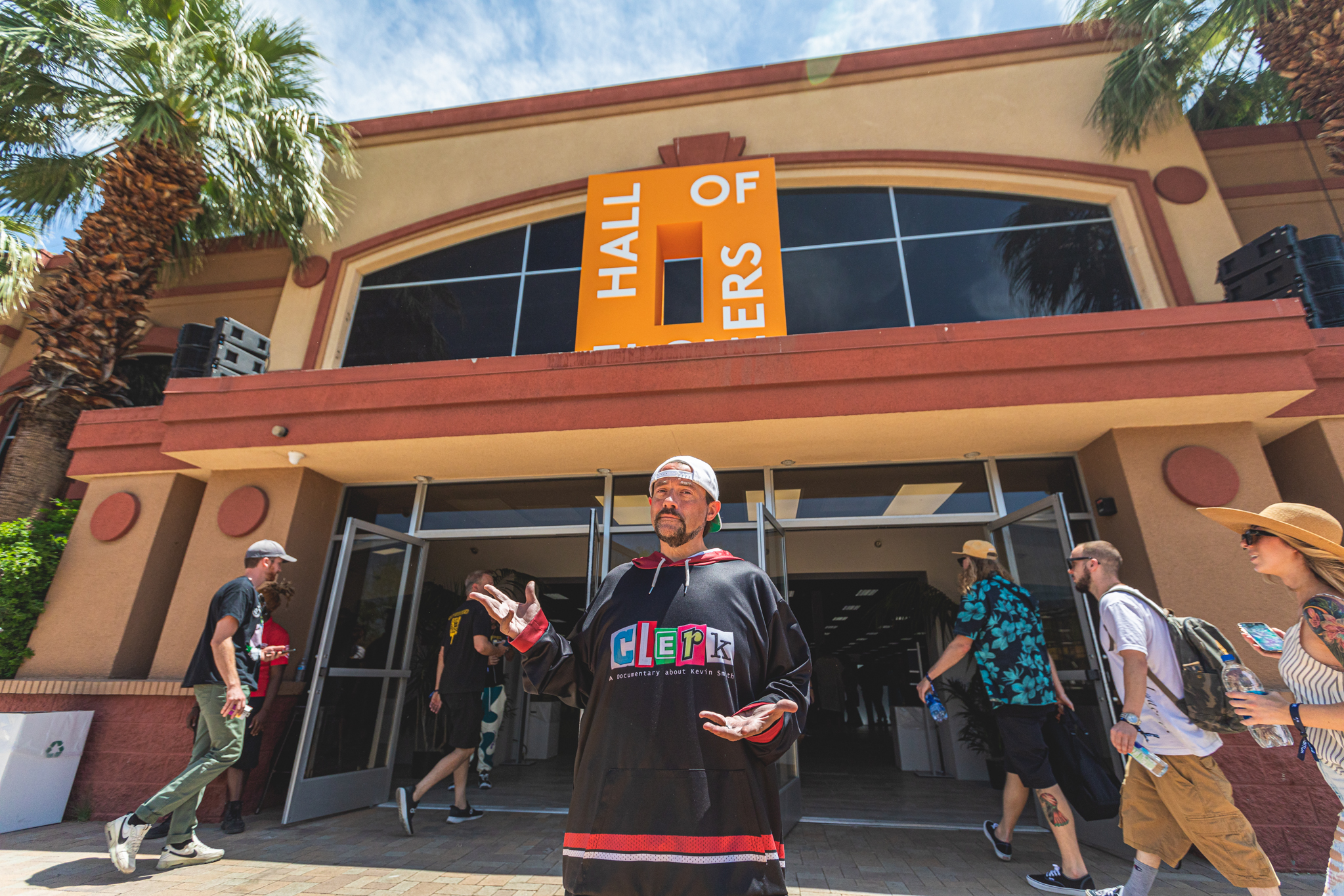
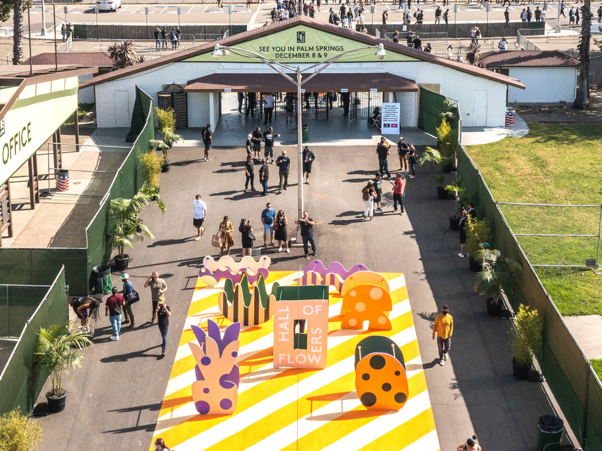
Hall of Flowers
With SuperMoreBetter
2019
Contribution:
Art Direction
Brand Design
Deliverables:
Brand Guidelines
With SuperMoreBetter
2019
Contribution:
Art Direction
Brand Design
Deliverables:
Brand Guidelines
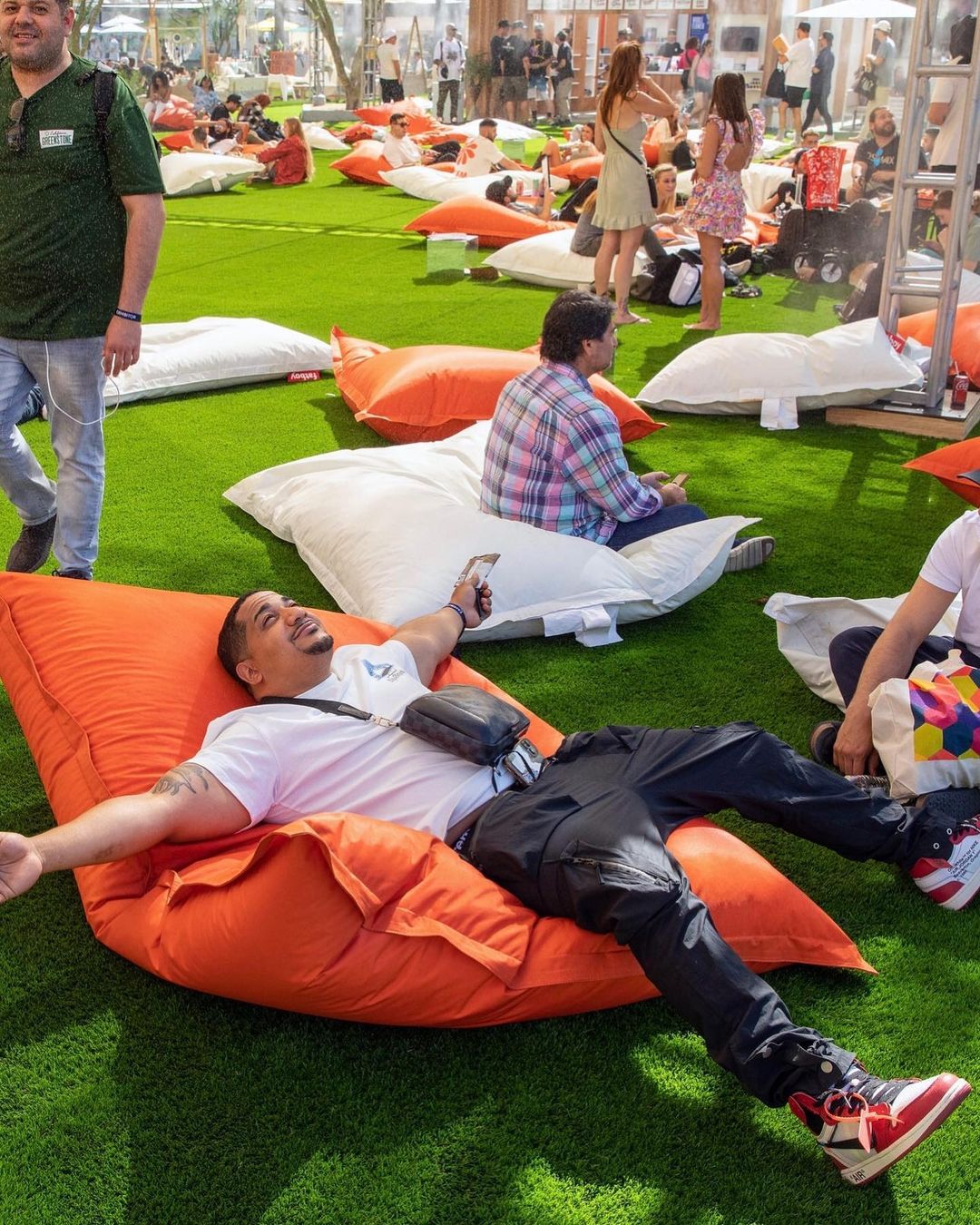
The challenge was to develop a branding system for HOF's seasonal Cannabis event series that could adapt and evolve from season to season. With HOF's immersive and playful event experience as a foundation, there was an opportunity to create a flexible identity that seamlessly integrated with each event.
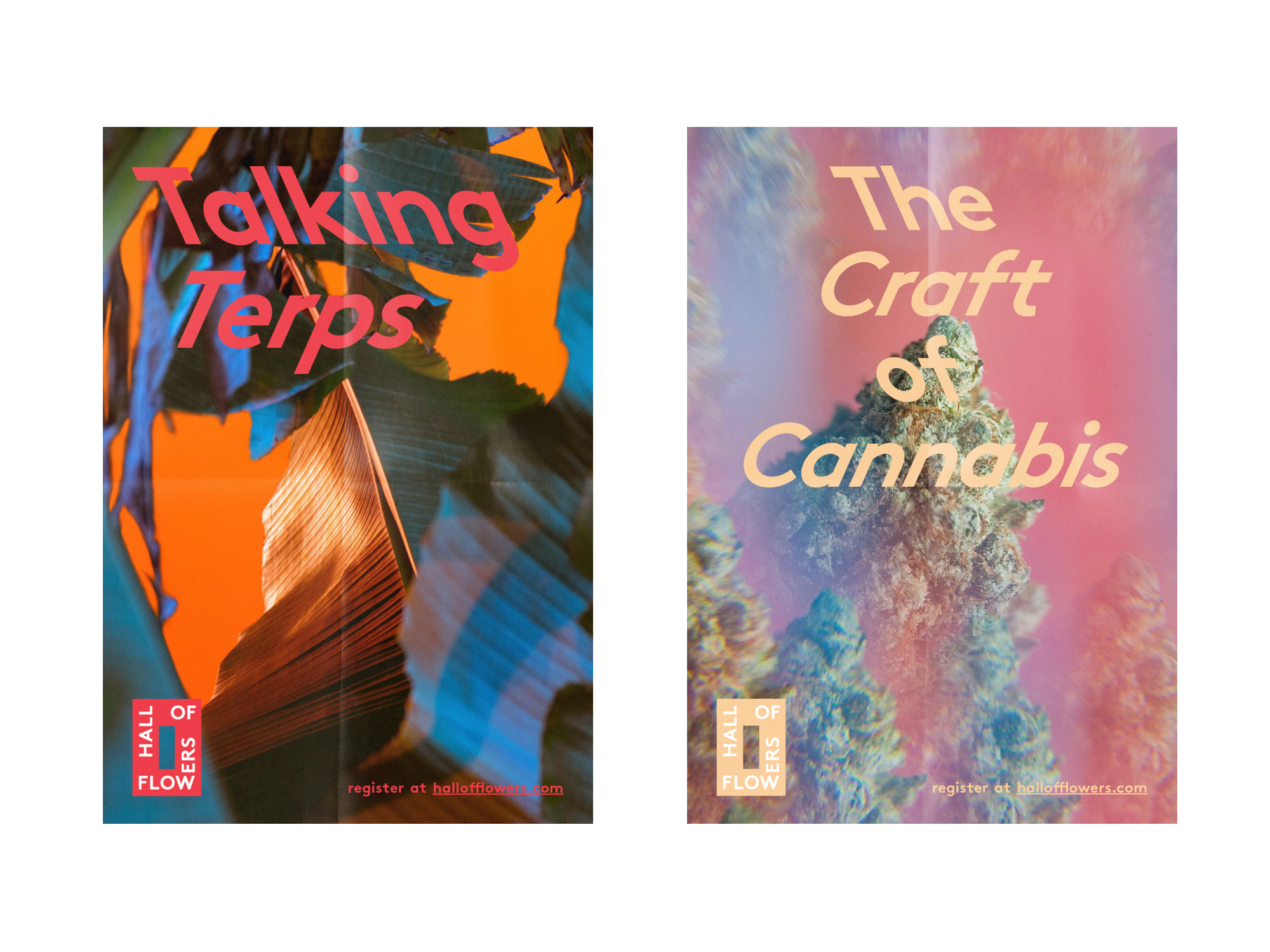
Our solution centered around the creation of the "Hall" logo mark, designed to stand out amidst the visually crowded trade show landscape. This logo mark served as the cornerstone of the HOF identity, offering simplicity and iconography that could withstand customization while retaining its iconic appeal.
The resulting branding system is highly adaptable, allowing for extensive customization while maintaining a cohesive and recognizable aesthetic. This flexibility ensures that the HOF identity can evolve alongside each season's unique themes and experiences.